Duck Shoes, Monochrome and Absent Armholes: A Review of London Fashion Week Outfits 2021
March 4, 2021
Like many events, London Fashion Week looked different this year. Designers displayed their work on the event’s website instead of having flashy runways, which means commoners like me had access (insert evil laugh).
Some designers decide to go far and make their outfits purely artistic and not the least bit functional, and others decide to go both routes. The last type of designer is all about showing how their pieces can be worn in day-to-day life.
Meaning, some of these outfits are meant to be looked at as paintings: admired but not something the average person, who isn’t a painter, or in this case, somebody who isn’t a runway model, can pull off.
There are fashion weeks often, all around the world from Copenhagen to Berlin to Shanghai. The most popular include New York Fashion Week and Paris Fashion Week, but London Fashion Week is a close third.
After looking through designer profiles for about an hour, I found the best and the worst of what the show had to offer.
Bethany Williams
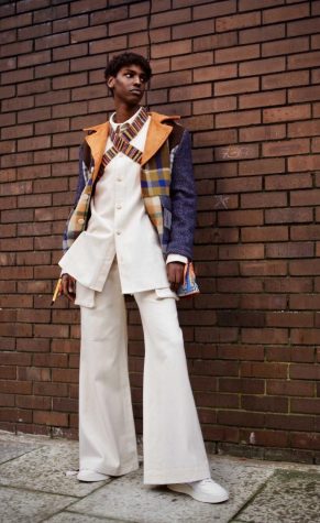
Designer Bethany Williams “launched the label to create positive social and environmental change in the world,” according to Williams’ profile on the London Fashion Week website. The outfits in this collection feature “hand-carved wooden buttons made from birch.”
The stark contrast between the orange hues on top and the all-white pantsuit and shoes are the perfect concoction for a fall and winter tone all in one.
I also like how the pants flare out, as they add structure.
My favorite part of the outfit, though, is the “X” neck piece. It adds an interesting element to the look. Without it, the outfit would be too plain.
Burberry
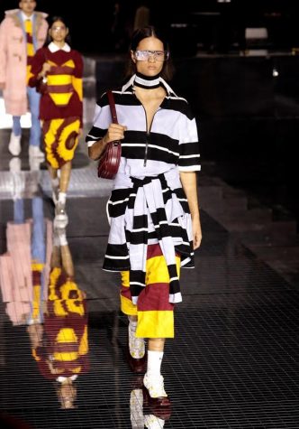
Burberry is known as one of the most famous fashion brands in the world, which is why I was shocked when I saw this atrocity.
Everything about the outfit clashes. This look could have worked without the unnecessary, hideous pop of red and yellow stripes, the bunching of fabric, the oddly thick socks and the color of the heels. Perhaps black or yellow shoes would have worked better.
Or perhaps nothing could have saved this outfit. Trash the whole ensemble.
I understand high fashion is very “out–there,” but this look tried to do too much and failed at every aspect.
Cortili
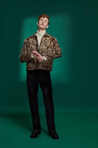
This was the first outfit I came across while shuffling through designers, and I loved it.
The jacket is obviously the star of the show. The boxy shape is appealing because it adds shape to the otherwise straight up-and-down look, and the pattern is simple yet makes a statement. I wish I had the money to buy this piece from the designer brand.
I also like the pairing of dress shoes with the outfit. They make for a classy vibe I’m here for.
16Arlington
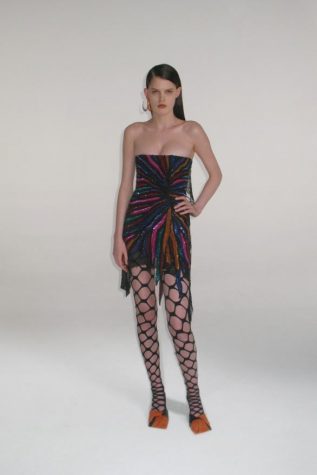
This brand, which is described as maximalist, has dressed Lizzo, Lady Gaga and Jennifer Lopez.
I like the dress and how the pattern spews out from one spot like a firework.
The shoes, however, are despicable. They look like duck feet. My condolences to the model who had to wear them.
The fishnets in this look don’t match with the rest of the outfit, because they have an awkward thickness to them. They make the outfit look bulky. Fishnets usually work when incorporated into a streetstyle outfit, but they don’t work here.
When showed this picture, freshman Pace Gibbs said, “That’s an outfit?”
Yes, it unfortunately is.
YUKI HASHIMOTO
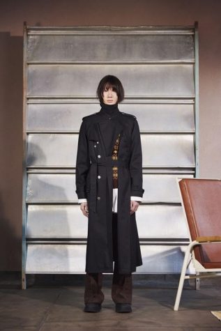
YUKI HASHIMOTO’s focus as a brand is on modernism, as you can see with this dream of an outfit.
The use of structure in the jacket is very interesting with the slit down the side, the buttons, the overlapping fabric and the belt.
I also like how the stylist matched the brown in the shirt with the pants but let the yellow pop through the cracks.
Baggy pants are in, and this look uses them to its advantage. They’re like the icing on the cake.
Junior Ryan Vancooney said, “I mess with the pants,” but unfortunately, he’s “not a big trench coat fan.”
Carmen Emanuela Popa
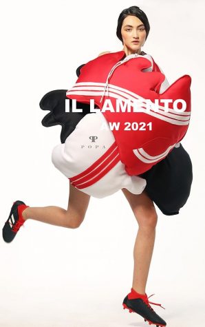
I wouldn’t think this classifies as an outfit, but apparently it does.
The thing is, I believe artistic expression is great in any form… any form except this one.
The rest of the designer’s pieces in this collection have similar silhouettes and vibes. Those “outfits” are artistic messes, whereas this one is a flat-out mess.
“I like the use of the stripes,” junior Shiv Vaghela said, and I agree. I like how they are in alternating colors which match the rest of the bubble, err… outfit, I mean.
Similar to the stripes, I like how the cleats match the rest perfectly.
Still, though, nothing can make this outfit look the least bit okay.
The poor model can’t use her hands and looks like a fish.
Xander Zhou
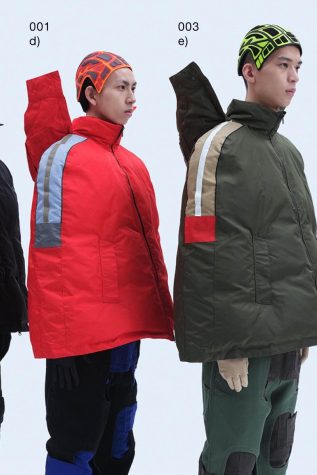
Before I get to my favorite look of the show, I want to go over this incredibly futuristic look. The absence of armholes, the wing-looking things on the back of the jackets and the caps all scream “3021” to me.
Senior Ian Kababih deems the fit “stylish,” yet “risky” and “out–there.”
The wings and caps add a lot to the look by giving you even more material to cock your head at.
The absence of armholes (is this a new trend or something?) adds yet another (uncomfortable) futuristic element.
The pants are wearable, unlike the rest of the outfit, but they look bulky. I’m not sure what to make of them.
Alvaro Mars
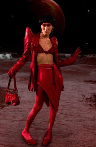
This out-of-this-world look is my favorite of all.
The differences in texture really seals the deal. It incorporates shine with the jacket and skirt, velvet with the purse and matte with the tights.
If you think about it, there’s a lot going on, but it’s cohesive because the designer chose to go with a monochrome look.
The shape of the jacket shoulder blades gives me spaceship commander energy.
The designer really pays attention to detail here. I like the circular bits on the purse strap, the shape of the shoes, the gloves and how the skirt ties.
Whoever wears this outfit will be the best-dressed person on Mars.
